Personal [INFOGRAPHICS] prove the medium has jumped the shark

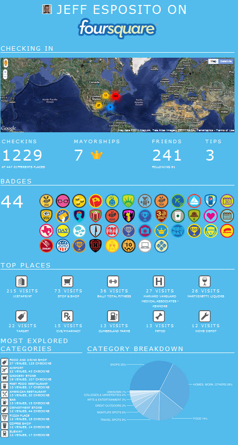
I know that everyone loves to produce infographics, but when it becomes something that you can create for yourself and does nothing but fan the flames of the ME generation, it is safe to say that they have indeed jumped the shark. Looking at these two below, I would be hard pressed to find anyone that could give me a real business value to them.

What do you think?

23 Responses to Personal [INFOGRAPHICS] prove the medium has jumped the shark
  1. MiniTerp
    July 27, 2011 | 7:36 am

    Well, sure there’s no business value to those (although I am enjoying your little cartoon guy), but that doesn’t mean the entire medium has jumped the shark. Infographics are still a great way to share information quickly, visually and interestingly. They may be a bit overused right now, but I still see their worth. Except for this one, this is never ok: http://badsignage.com/infographics-gone-wild

  2. jeffespo
    July 27, 2011 | 9:39 am

    @MiniTerp How many come out in a week? I would guess at least three dozen, so like the Fonz I have to say Ayyye

  3. TDefren
    July 27, 2011 | 9:55 am

    @jeffespo And yet when I saw your Twitter infographic I kinda wanted to make my own. So there’s that.

  4. jenbennettnj
    July 27, 2011 | 9:56 am

    @jeffespo I couldn’t help but infographic myself and it says my interestingness is 0% HAHAHAHAHAHAHA

  5. jeffespo
    July 27, 2011 | 9:56 am

    @TDefren Well there you go… question is though what good is it to anyone but you pal?

  6. jeffespo
    July 27, 2011 | 9:56 am

    @jenbennettnj Well I could have told you that

  7. jenbennettnj
    July 27, 2011 | 9:58 am

    @jeffespo hahahahahahahahahahahaha

  8. jeffespo
    July 27, 2011 | 9:59 am

    @TDefren So on a side note how much do you really love seeing 10-30 new infographics a day>?

  9. TDefren
    July 27, 2011 | 10:04 am

    @jeffespo I don’t mind the 10+ infographics I see each day since 20% of them = awesome. Data floods us today. Visualization = comprehension.

  10. jeffespo
    July 27, 2011 | 10:04 am

    @TDefren The other percent are god awful and I wish that I only saw 10 or so pal. I prefer pure data with context to images

  11. TDefren
    July 27, 2011 | 10:06 am

    @jeffespo As bad as some of the images are, the ability of most journals to add genuine, unbiased, fruitful “context” is typically worse. 😉

  12. jeffespo
    July 27, 2011 | 10:07 am

    @TDefren wait they are supposed to be unbiased 😉 All settled from the move?

  13. TDefren
    July 27, 2011 | 10:08 am

    @jeffespo Settled from the move, but have my eyes on the Countdown Clock for when I can move back. T-minus 1 year, 10 mos. til return to SF!

  14. jeffespo
    July 27, 2011 | 10:08 am

    @TDefren wait I thought you were back out in SF in Boston now?

  15. TDefren
    July 27, 2011 | 10:13 am

    @jeffespo I was in SF for one year; moved back to Boston temporarily. http://t.co/dJdsIXM

  16. jeffespo
    July 27, 2011 | 10:16 am

    @TDefren must have missed it, but welcome back and sheesh that is one hell of a ton of miles

  17. jeffespo
    July 27, 2011 | 11:15 am

    @mikefixs TY sir

  18. mikefixs
    July 27, 2011 | 11:44 am

    @jeffespo You’re welcome – I’m currently working on a blog about the debate around social influence and may yet link to that post 🙂

  19. jeffespo
    July 27, 2011 | 11:44 am

    @mikefixs sounds good, let me know if there is anything more you might need help with

  20. jeffespo
    July 27, 2011 | 7:24 pm

    @SeanMcGinnis @khenderick @bobfine thanks for sharing

  21. […] Personal [INFOGRAPHICS] prove the medium has jumped the shark (jeffesposito.com) […]

  22. JPedde
    October 12, 2011 | 11:31 am

    Yea, these two are just funny and get a lot of traction for visual.ly. But I don’t think the medium has jumped the shark — people have always loved cartoons. Honestly I have so much fun critiquing the bad ones. We generate dozens of links from 1 infographic, as well as hundreds upon hundreds of facebook shares and tweets, even +1s. Not to mention pretty great PR, brand awareness, and relationship building to bloggers that we might not have otherwise had a real reason to talk to.

  23. jeffespo
    October 12, 2011 | 8:19 pm

    @JPedde My problem is that people make them for everything and they are this year’s black. The beef is that only 1 out of 25+ is worthwhile. Lots of folks just click the RT button given the Tweet with [INFOGRAPHIC] In them.What do you produce them for?

Personal [INFOGRAPHICS] prove the medium has jumped the shark

I know that everyone loves to produce infographics, but when it becomes something that you can create for yourself and does nothing but fan the flames of the ME generation, it is safe to say that they have indeed jumped the shark. Looking at these two below, I would be hard pressed to find anyone that could give me a real business value to them.

What do you think?
23 Responses to Personal [INFOGRAPHICS] prove the medium has jumped the shark
  1. MiniTerp
    July 27, 2011 | 7:36 am

    Well, sure there’s no business value to those (although I am enjoying your little cartoon guy), but that doesn’t mean the entire medium has jumped the shark. Infographics are still a great way to share information quickly, visually and interestingly. They may be a bit overused right now, but I still see their worth. Except for this one, this is never ok: http://badsignage.com/infographics-gone-wild

  2. jeffespo
    July 27, 2011 | 9:39 am

    @MiniTerp How many come out in a week? I would guess at least three dozen, so like the Fonz I have to say Ayyye

  3. TDefren
    July 27, 2011 | 9:55 am

    @jeffespo And yet when I saw your Twitter infographic I kinda wanted to make my own. So there’s that.

  4. jenbennettnj
    July 27, 2011 | 9:56 am

    @jeffespo I couldn’t help but infographic myself and it says my interestingness is 0% HAHAHAHAHAHAHA

  5. jeffespo
    July 27, 2011 | 9:56 am

    @TDefren Well there you go… question is though what good is it to anyone but you pal?

  6. jeffespo
    July 27, 2011 | 9:56 am

    @jenbennettnj Well I could have told you that

  7. jenbennettnj
    July 27, 2011 | 9:58 am

    @jeffespo hahahahahahahahahahahaha

  8. jeffespo
    July 27, 2011 | 9:59 am

    @TDefren So on a side note how much do you really love seeing 10-30 new infographics a day>?

  9. TDefren
    July 27, 2011 | 10:04 am

    @jeffespo I don’t mind the 10+ infographics I see each day since 20% of them = awesome. Data floods us today. Visualization = comprehension.

  10. jeffespo
    July 27, 2011 | 10:04 am

    @TDefren The other percent are god awful and I wish that I only saw 10 or so pal. I prefer pure data with context to images

  11. TDefren
    July 27, 2011 | 10:06 am

    @jeffespo As bad as some of the images are, the ability of most journals to add genuine, unbiased, fruitful “context” is typically worse. 😉

  12. jeffespo
    July 27, 2011 | 10:07 am

    @TDefren wait they are supposed to be unbiased 😉 All settled from the move?

  13. TDefren
    July 27, 2011 | 10:08 am

    @jeffespo Settled from the move, but have my eyes on the Countdown Clock for when I can move back. T-minus 1 year, 10 mos. til return to SF!

  14. jeffespo
    July 27, 2011 | 10:08 am

    @TDefren wait I thought you were back out in SF in Boston now?

  15. TDefren
    July 27, 2011 | 10:13 am

    @jeffespo I was in SF for one year; moved back to Boston temporarily. http://t.co/dJdsIXM

  16. jeffespo
    July 27, 2011 | 10:16 am

    @TDefren must have missed it, but welcome back and sheesh that is one hell of a ton of miles

  17. jeffespo
    July 27, 2011 | 11:15 am

    @mikefixs TY sir

  18. mikefixs
    July 27, 2011 | 11:44 am

    @jeffespo You’re welcome – I’m currently working on a blog about the debate around social influence and may yet link to that post 🙂

  19. jeffespo
    July 27, 2011 | 11:44 am

    @mikefixs sounds good, let me know if there is anything more you might need help with

  20. jeffespo
    July 27, 2011 | 7:24 pm

    @SeanMcGinnis @khenderick @bobfine thanks for sharing

  21. […] Personal [INFOGRAPHICS] prove the medium has jumped the shark (jeffesposito.com) […]

  22. JPedde
    October 12, 2011 | 11:31 am

    Yea, these two are just funny and get a lot of traction for visual.ly. But I don’t think the medium has jumped the shark — people have always loved cartoons. Honestly I have so much fun critiquing the bad ones. We generate dozens of links from 1 infographic, as well as hundreds upon hundreds of facebook shares and tweets, even +1s. Not to mention pretty great PR, brand awareness, and relationship building to bloggers that we might not have otherwise had a real reason to talk to.

  23. jeffespo
    October 12, 2011 | 8:19 pm

    @JPedde My problem is that people make them for everything and they are this year’s black. The beef is that only 1 out of 25+ is worthwhile. Lots of folks just click the RT button given the Tweet with [INFOGRAPHIC] In them.What do you produce them for?

Google